Wireframe vs. prototype

Summary
In this guide, you will learn:
Differences between wireframes, mockups, and prototypes (fidelity, interactivity).
Wireframes: low-fidelity, early layouts for structure.
Mockups: medium to high-fidelity static designs, visual appearance.
Prototypes: high-fidelity, interactive models for testing and feedback.
When to use each: wireframes (initial concepts), mockups (visuals), prototypes (usability testing).
How Miro aids in creating mockups and prototypes, including AI-assisted rapid prototyping.
Try Miro now
Join thousands of teams using Miro to do their best work yet.
Wireframes vs. prototypes: The dynamic duo of design
Alright, let's get real about two terms that get tossed around a lot in our world: wireframes and prototypes. Yes, they're both crucial steps in the whole design dance, but they're not interchangeable partners. Understanding the nitty-gritty of wireframes and prototypes—what they are, why they matter, and when to use which—can seriously streamline your design process. So, let's dive in and decode these essentials, shall we?
Try Miro now
Join thousands of teams using Miro to do their best work yet.
Wireframes: The blueprint stage
Imagine wireframes as the blueprint of your digital project. They're the first step in bringing your ideas into some semblance of visual reality, focusing squarely on structure and layout. Here's the scoop on wireframes:
Keep it simple: Wireframes are the minimalists of the design world, usually rocking a monochrome palette with basic icons and placeholders. It's all about mapping out where everything goes without getting distracted by design details.
Functionality first: At this stage, we're zooming in on how the site or app functions and how users will navigate through it. Wireframes help us lay down the user journey, ensuring the structure is solid before we get all fancy with visuals.
Team talk: Wireframes are brilliant for getting everyone on the same wavelength early on. They're like the universal language for designers, developers, and stakeholders, making sure we're all nodding along to the same beat.
Looking at wireframe examples can be particularly helpful in this phase, offering insights into how others have structured their layouts and giving your team a starting point for discussions.
Prototypes: Bringing designs to life
Now, if wireframes are the blueprint, prototypes are the model home that lets you really see how everything works. They're interactive, detailed, and a lot closer to what the final product will feel like. Prototypes are where things get exciting:
Click and explore: Unlike the static nature of wireframes, prototypes invite you to click around, scroll, and interact. This hands-on experience is invaluable for testing and refining the design.
Looks matter: This is where we bring in the colors, fonts, images, and animations, giving us a taste of the visual vibe of the final product.
User testing gold: Prototypes are perfect for user testing, offering real insights into the user experience and highlighting tweaks needed before hitting the development highway.
The real difference between wireframes and prototypes
So, wireframes and prototypes, while part of the same story, play very different roles:
Timing is everything: Wireframes kick things off, focusing on the bones of the project. Prototypes come in once those bones have some muscle, ready to test how the body moves.
Detail level: Wireframes are all about simplicity and structure. Prototypes dial up the detail, showing off the design and interactivity.
End goal: Wireframes ensure everyone agrees on the basic layout and function. Prototypes are about fine-tuning the experience, making sure it's not just functional but fabulous.
High-fidelity wireframes vs. prototypes: The fine line of detail
Now, let's add another layer to this conversation by talking about high-fidelity wireframes and how they stack up against prototypes. Yes, we're diving deeper into the design rabbit hole, but stick with us. Understanding the distinction between high-fidelity wireframes and prototypes and knowing when to deploy each can supercharge your design process.
High-fidelity wireframes: Detail meets structure
High-fidelity wireframes are like wireframes that decided to dress up for the occasion. They still outline the structure and layout, but with a bit more flair and a lot more detail. Here's what sets them apart:
Rich detail: High-fidelity wireframes bring in elements like exact spacing, precise images, and sometimes even color, offering a more accurate representation of the final product.
Closer to reality: While still static, these wireframes give stakeholders a clearer picture of what to expect, blending the structural focus of wireframes with the visual appeal closer to that of prototypes.
Communication plus: They are a powerful tool for discussing design concepts with clients and team members, providing a detailed but not fully interactive look at the proposed design.
Prototypes: Interaction takes the stage
While high-fidelity wireframes up the ante in terms of visual detail, prototypes bring the dimension of interaction to the forefront. They are not just looked at; they are experienced. Prototypes are all about:
Dynamic interaction: Prototypes mimic the final product's functionality, allowing user interaction with clickable elements, transitions, and animations.
User experience focus: Beyond visuals, prototypes are invaluable for testing and refining the user experience, providing insights into usability and flow.
Feedback and iteration: With their interactive nature, prototypes are perfect for gathering detailed user feedback, enabling iterative design improvements based on real user interactions.
Navigating the nuances: When to use which
Understanding the nuances between high-fidelity wireframes and prototypes can help you make strategic decisions in your design process:
High-Fidelity Wireframes
Ideal when you need to present detailed design concepts without requiring interactivity to convey the idea. They're great for internal reviews and when you need to nail down the visual details before diving into the complexities of interaction.
Prototypes
The go-to when your design needs to be tested in the wild, experiencing how users interact with your interface. They're crucial for user testing phases, where the feel of the user journey and the interactivity of elements are under the microscope.
Choosing your tool wisely
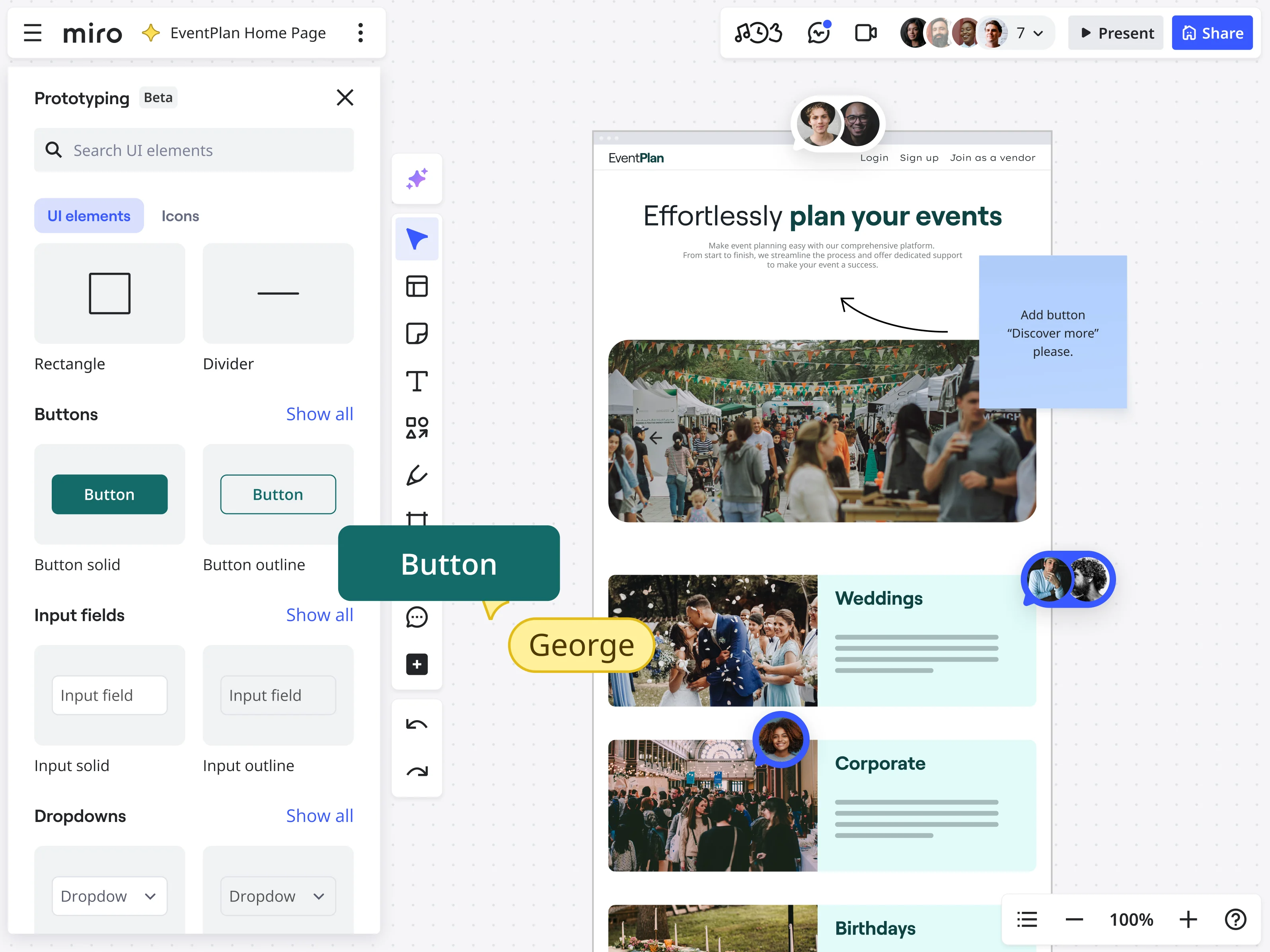
Knowing when to wireframe and when to prototype can make your design process smoother and more effective. Start with wireframing to get the layout locked down. Miro's wireframe tool can help you get started. Once you're confident in the flow and function, shift gears to prototyping to refine the user interaction and visual appeal. With our intelligent canvas, you have a powerful environment for mapping out those initial product visions—whether they're simple wireframes or more developed mockups. Now, we're taking that capability a significant step further with our new AI-powered prototyping features.
Imagine dramatically speeding up how you create a prototype; you can now instantly generate foundational prototype concepts from your existing ideas—like sketches or stickies. You can also build out interactive user flows with remarkable ease and rapidly iterate on your designs, all fueled by AI that integrates seamlessly within the Miro environment you already know. This upgrade means your team can transition from a brainstormed concept to a testable, interactive prototype faster than ever before, empowering everyone to contribute effectively and align on the product vision much earlier in the process.
Wrapping up
The journey from wireframes to prototypes is filled with critical stops, including the often-overlooked high-fidelity wireframe station. Each step—whether it's a basic wireframe, a detailed high-fidelity wireframe, or a fully interactive prototype—serves a unique purpose in the design ecosystem. By understanding the distinctions and appropriate applications of each, you can ensure your design process is both efficient and effective. And with Miro as your sidekick, navigating these stages becomes a collaborative, dynamic adventure, paving the way for successful, user-centered design outcomes.
Author: Miro Team
Last update: October 22, 2025