What is a website wireframe?

Summary
In this guide, you will learn:
What a website wireframe is: a basic black-and-white layout outlining structure, content, and navigation without visual design.
The purpose of wireframes: to focus on functionality, user flow, and content priority early in design.
How wireframes help visualize site architecture and user journeys, turning sitemaps into tangible page layouts.
The role of wireframes in iterative design: they are easier and cheaper to adapt than full designs, allowing early feedback.
Common tools and methods for creating wireframes, from hand sketches to specialized software or HTML prototypes.
Why wireframing is essential: it acts as the blueprint of a website, ensuring structure supports business goals and user needs.
What is a website wireframe? Everything you need to know
If you've ever built or redesigned a website, you've likely heard the term "wireframe" thrown around. But what is a website wireframe, and why is it such a vital part of the web design process? Whether you're a seasoned UX designer, a developer, or even part of a marketing team looking to understand your product's online presence better, this guide will walk you through everything you need to know about website wireframes. By the end, you'll be itching to sketch out your own.
Try Miro now
Join thousands of teams using Miro to do their best work yet.
Website wireframe explained
At its core, what is a website wireframe? It's like a blueprint for your website. It's a simplified visual guide that shows the basic structure of a webpage, without all the colors, images, and fancy fonts. Think of it like the skeleton of your site—it lays out where things like buttons, text, and images will go. You're essentially mapping out the user's journey through the site, giving everyone from designers to developers a clear vision of how things should work before diving into the nitty-gritty details.
Wireframes help visualize the hierarchy of your content, making it easy to communicate ideas to stakeholders or teammates. It's a way to map out functionality, ensuring that each element serves a purpose before jumping into design. Using wireframe templates can further simplify this process, providing a pre-built framework that speeds up planning and ensures consistency across pages.
Key elements of a website wireframe
Now that we know what a website wireframe is, let's dig into what it typically includes. Here are the most important elements to consider:
Navigation (menus and links): Wireframes outline where the navigation elements will be placed to ensure users can easily move through your site.
Header and footer areas: These are often static sections across most pages and include essential information like logos, contact details, and copyright information.
Content sections: Whether it's text blocks, images, or videos, the wireframe shows where your core content will live on each page.
CTAs (Call to Actions): Buttons that prompt users to take action, such as "Sign up," "Download," or "Buy now," are a must-have in any website wireframe.
User flows: Wireframes help designers map out the user's journey through the site. It's a clear visual of how users will interact with each part of the website.
By focusing on these elements, your wireframe gives your team a cohesive view of how everything fits together before any development work begins. It's the key to staying aligned and preventing surprises down the line.
Website wireframe elements unpacked
Creating a wireframe is like sketching the blueprint for your website. It lays the groundwork for what's to come, ensuring that the final website is beautiful, functional, and user-friendly. Understanding the key elements in detail is crucial to truly harnessing the power of website wireframes. Let's dig deeper into each component that makes up the anatomy of a website wireframe.
1. Layout structure: The foundation
The layout structure is the backbone of your wireframe. It defines how content and interactive elements are organized across the page, ensuring a logical flow and an intuitive user experience. This includes:
Grid systems: Using a grid helps in maintaining consistency across different pages, making your design more cohesive.
White space: Balancing content with adequate white space improves readability and focuses user attention where it's needed.
Visual hierarchy: Establishing a clear hierarchy guides users through your content in a deliberate way, emphasizing key elements like headlines and calls to action.
2. Navigation: The roadmap
Effective navigation is akin to a well-drawn map; it guides users to their desired destination with ease. In wireframes, navigation elements include:
Menus: Whether it's a top navigation bar, sidebar, or dropdown menus, these elements outline how users will move through your site.
Link placement: Identifying where to place links within your content helps in creating a seamless journey, encouraging exploration without confusion.
Breadcrumb trails: For sites with multiple layers, breadcrumbs assist users in tracking their path and navigating back when needed.
3. Content placement: The storyteller
Content is the heart of your website, telling your brand's story. In wireframing, the placement of content elements dictates how this story unfolds:
Headings and text: Mapping out where headings, subheadings, and body text go helps create a narrative flow.
Images and icons: Placing visual elements like images and icons can break up text, making the content more digestible and engaging.
Videos and interactive elements: Identifying spaces for multimedia enhances engagement, but it's crucial to balance these with the overall content strategy.
4. Functionality: The interaction
A wireframe also outlines how users will interact with the site. This encompasses:
Call-to-action (CTA) buttons: Strategic placement of CTAs guides users towards taking desired actions, be it signing up, making a purchase, or learning more.
Forms: Placement and design of forms for newsletter sign-ups, contact information, or search bars are crucial for user interaction.
Interactive elements: Planning for sliders, tabs, or accordion elements that don't overwhelm the user but enhance the experience.
5. Branding elements: The personality
Even in the skeletal phase, incorporating placeholders for branding elements is essential. This includes:
Logo: A placeholder for the logo sets the stage for brand presence, typically at the top of the page.
Color scheme: While detailed design isn't the focus, indicating areas for brand colors can aid in visual planning.
Fonts and typography: Noting font hierarchies and styles ensures that the wireframe aligns with brand identity, even if specific designs are not yet finalized.
Each element of a wireframe is essential for outlining a website's design and functionality. By focusing on the layout structure, navigation, content placement, functionality, and branding elements, you develop a blueprint that ensures the final website is not only visually appealing but also an exemplary model of user experience and functionality. Remember, a well-crafted wireframe is the first step in turning your vision into a digital reality.
Do you need a website wireframe?
Short answer: Sometimes.
When you need one: If you're designing a website from scratch or overhauling an existing site, a wireframe is crucial. It acts as a roadmap, helping you figure out the site's layout and ensuring all elements work together harmoniously. Wireframes are especially important for large-scale projects with complex user flows or when multiple stakeholders are involved. They also help catch potential usability issues early on, before any design or development work starts.
When you might not need one: If you're making small tweaks to an existing website, like adding a single page or updating content, you may not need a full wireframe. Similarly, if you have a very small project with a simple structure (like a basic landing page), and you have a clear vision in mind, you might be able to skip the wireframe step and go straight to design. Just keep in mind that skipping this step can lead to unforeseen issues down the line, especially if you aren't working with a seasoned design and dev team.
Tips on how to create website wireframes like a pro
Creating effective wireframes doesn't happen by accident. Here's how to refine your process:
Start with a goal: Every wireframe should begin with a clear understanding of what you want the page to achieve. Keep user actions and conversions in mind.
Go low-fi to start: Begin with low-fidelity sketches to explore ideas quickly. Use pen and paper or simple drawing tools to iterate fast.
Use real content when possible: Placeholder text has its place, but using real content, even in draft form, can help better understand space and layout needs.
Prioritize usability over design: Focus on creating a logical flow and intuitive navigation. Pretty comes later.
Feedback loop: Share early and often with your team. Wireframing is collaborative, and fresh eyes can spot issues or improvements you might miss.
Keep accessibility in mind: Plan for accessible design from the start. Consider how elements can be adapted for all users, including those with disabilities.
Get inspired by our website wireframe examples
If you're feeling stuck or just want some fresh ideas, here are some great wireframe templates to explore:

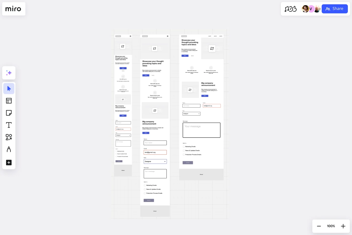
Website wireframing template: This template gives you a head start in structuring your website's key elements, whether you're focusing on a single page or multiple.

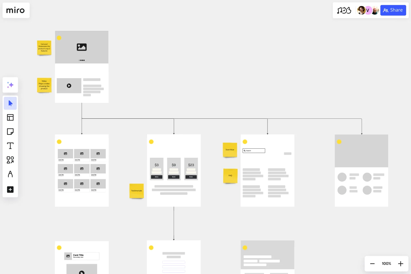
Website flowchart template: Ideal for mapping out user flows, this template helps visualize the steps a user takes through your website, from landing to conversion.

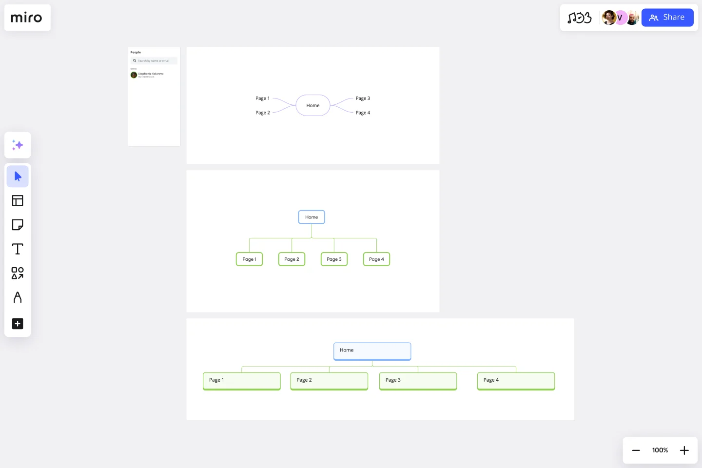
Sitemap template: For larger projects, sitemaps help keep track of all the pages and content. This template ensures your site's hierarchy is clear and easy to navigate.

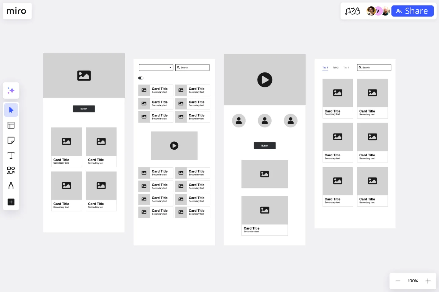
Low-fidelity wireframe template: This option is perfect for when you're at the brainstorming stage and need to quickly sketch out ideas without focusing too much on details. It's all about capturing the core structure.
Browsing through these examples can give you a better sense of what might work best for your project and how to tackle your own wireframe design with confidence.
Take your website wireframe to the next level with Miro
Creating a website wireframe is a crucial step, but it doesn't have to be a complicated one. With Miro's innovation workspace, you have everything you need to sketch out your website's structure, collaborate with your team in real time, and iterate faster with tools like Miro AI. And with our extensive library of ready-made templates, building your wireframe is as easy as drag-and-drop.
Whether you're a UX designer mapping out a seamless user journey or a marketer trying to visualize your next campaign landing page, Miro gives you the flexibility and collaboration features to turn your wireframe into a working reality. And now, with Miro's new AI-powered prototyping features, you can take those wireframes even further. Effortlessly transform your static layouts into interactive prototypes, allowing you to build out user flows, test concepts, and gather feedback on a more dynamic representation of your site faster than ever. Start exploring what Miro can do for your wireframing process today.
Author: Miro Team Last update: August 13, 2025