What is UI design? The ultimate guide

Summary
In this guide, you will learn:
What UI design is and why it is important for creating effective digital products
Fundamental UI design principles and best practices to guide your design process
How to begin wireframing and prototyping to plan and visualize your interface layout
Ways to bring your UI design ideas to life using Miro’s collaborative tools and templates
How to use Miro to iterate, review, and refine your UI designs with team feedback
How Miro integrates with other design and development tools to streamline your workflow
Try Miro now
Join thousands of teams using Miro to do their best work yet.
Lots of work goes into delivering an exceptional user experience — from conducting research to leveraging design tools. Yet through it all, it’s important to remember that your users will only notice what they see on their screens: the interface itself. That’s where good user interface (UI) design comes in.
In this guide, we'll take you through everything you need to know about UI design — including why it matters, the key principles, and the best practices.
What is UI design?
When was the last time you truly enjoyed browsing through a website or an app because the content was easy to understand and pleasant to look at? What about the last time you had the opposite experience, where you couldn’t find what you wanted because of how unappealing or overwhelming an app felt? Both cases are the result of a product’s UI design.
UI design is the craft of designing a digital product’s visual and interactive elements. In other words, it’s about designing what users will see on their screens.
To better understand what UI design is, it helps to compare it to user experience (UX) design, which it’s easy to mix up with. Unlike UX designers, UI designers specifically make decisions about what users should see on their screens — like what shape a button should be, whether certain color contrasts are too harsh, or what kind of typography is best. Whether it’s for a website or a mobile app, UI design is all about getting the look and feel of a digital product right.
UX designers, on the other hand, think about mapping out the journey users will take as they navigate content, like how a user might make their way from the homepage to checkout. And because UI design plays an important role in a user’s journey, we can think of it as a part of the wider UX design field, given that the two serve interconnected purposes.
Why is UI design important?
A well-designed user interface makes a big difference in how users perceive a product. When users can easily find their way around an interface and complete the activities they came to do, it’s not just good for user experience but also for business overall.
Take a landing page that’s selling a product, for example. The easier it is for potential customers to read and digest its content, the less likely they’d be to close the landing page out of confusion. And even if they’re really excited to buy the product, it’s still important that they can easily find the call-to-action button. After all, you can’t make a purchase if you don’t know where the “buy now” button is.
Aesthetics play just as important of a role here. The more visually captivating and inviting an interface is, the more likely it is to draw a user in and have them further explore it. On top of that, UI design is also a powerful form of brand expression; it’s a chance to educate your users on what your brand looks like, how relatable or appealing it is, and to invest in how well they’ll remember your product.
Key principles of UI design
When it comes to UI design, sticking to a few key principles will keep your user interface both seamless and visually appealing. Let's explore three principles that embody what UI design is all about.
1. Put the user first
It’s in the name — UI design is all about creating an interface for your users. That means it’s worth asking yourself whether each design decision you make caters to your users’ wants and needs. And that takes both knowledge and empathy. For a closer look at what your users need, visualize your findings in Miro using our empathy map template.
Conduct in-depth research on who your users are and what problems they’re looking to solve. Create user personas to take a closer look at what motivates them to solve their problems or what holds them back. And even after you’ve rolled your design out, be sure to continuously test your interface and integrate user feedback to keep it functional, appealing, and relevant over time.
2. Keep your design simple
While you want your interface to be informative, it’s often best to keep the design simple. A clutter-free interface reduces distractions and guides users toward their goals more efficiently.
Keeping your look consistent matters too, such as using the same typeface for all headers, using the same shape for all buttons, or using the same layout whenever you insert images. Consistency helps keep your interface familiar and predictable, which makes it easy for your users to find information quickly.
And don’t be afraid to make use of white space either. Thoughtfully leaving certain parts of your design empty keeps your content readable and helps your users focus on what matters most.
3. Use a visual hierarchy
Speaking of helping your users focus on what matters, maintain a hierarchy among your visual elements. User interfaces combine all kinds of text, images, illustrations, and shapes. To avoid overwhelming your users with a variety of content, make sure your design emphasizes what you want them to focus on first. Some common examples of maintaining a hierarchy include making your headers bigger than your body text or giving important call-to-action buttons bold colors.
Whether you’re using size, color, or positioning, it’s all about guiding users through the content efficiently and helping them develop clear and meaningful takeaways.
What does a UI design process include?
Designing an outstanding UI isn't just about making things look pretty — it's a journey that's packed with research, creativity, and lots of fine-tuning. And while every team might have their own workflows, here are three important steps every UI designer should take:
1. Start with research and analysis
Every great UI starts with a clear picture of who you’re designing for and why. In fact, it’s not just about knowing what your users want but also what your business goals are. Conduct market research to learn more about what design practices work best in your industry.
For example, if you’re interested in getting website visitors to convert, how can your design encourage them to take action without overwhelming them or coming off as pushy? It also helps to study your competitors. What are they getting right? What could they improve on?
While you should conduct research about your users, it’s also worth reaching out to them directly — such as via surveys or focus groups. If you work with a customer support team, their knowledge can be a goldmine too. Talk to them to learn about what your existing users have enjoyed about your product or been frustrated with in the past. These findings can go a long way in informing your design decisions.
2. Begin wireframing and prototyping
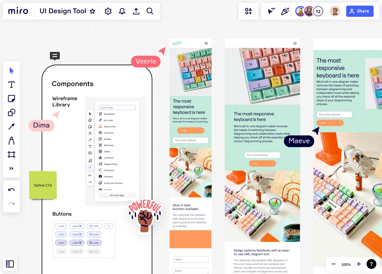
Before diving straight into visual design, you need a layout of your interface. That's where wireframes come in. Think of them as the pencil sketch before the painting. Wireframes outline where everything goes and how the different elements of your interface fit together. Want to save time on building entire wireframes from scratch? Get started with Miro’s website wireframing template or Miro’s app wireframing template.
Once you're happy with your wireframe, bring it to life with prototypes. UI prototypes are meant to look and function as closely to the real thing as possible. Using the right prototyping tool, you can easily create interactive prototypes without having to send them off to developers yet. Miro lets you link between different objects on your board, allowing you to demonstrate what happens if a user were to click on a button or a menu item, for example. You’ll even find a prototype template to get started with.
3. Conduct UI testing and refinement
Releasing a user interface without testing it is like being a chef who serves a dish without tasting it first. In the world of digital products, the taste test is all about observing how users interact with your design and identifying ways to improve their experience.
Techniques like A/B testing help you compare design variations — whether you’re testing different types of copy or color schemes. Every observation reveals more about what your users like and dislike. Every tweak and adjustment you make based on their feedback pushes your interface closer to the best possible version you can deliver. After all, testing your product embodies what UI design is all about; putting your users first.
UI design best practices
Now that you’ve got a clearer picture of what UI design is, let’s delve deeper into a few best practices that’ll take your design from good to excellent. Remember, exceptional UI design is more than just aesthetic appeal; it's about creating intuitive experiences. So here are some key tips every UI designer should have up their sleeve:
1. Keep accessibility in mind
When putting users first, remember that you’re designing for fellow humans — and we’re a diverse group. That means designing inclusively matters, and that includes making sure anyone can use your product regardless of their abilities. Some examples include using color contrasts that keep visual impairment in mind or making sure people can fully navigate your website using just a keyboard.
When in doubt, you can always check how accessible your designs are by referring to Web Content Accessibility Guidelines (WCAG) — the organization that sets accessibility standards on the internet.
2. Create responsive designs
People are hopping from one device to another more than ever before, which makes it increasingly crucial to provide users with a consistent digital experience no matter how they’re logging on. It’s called responsive design.
Responsive design is about making sure your UI’s visuals and functionalities adapt beautifully across various devices, whether it’s a smartphone, smart TV, tablet, or desktop. Don’t forget about different screen resolutions either. Techniques like fluid layouts, scalable images, and adaptable typography all help you offer a consistent look and build trust with your users.
3. Use an effective UI design tool
Using the right UI design tool goes a long way. Just as you want to design user-friendly interfaces, it’s important that your tool is easy to use too. But there are a few more capabilities to look out for. Keep in mind, for example, that you’ll need to be able to easily share your wireframes and prototypes with team members for feedback. In this case, a tool that enables real-time collaboration, commenting, and sharing would allow you to work more efficiently.
It’s also worth getting a tool that easily integrates with all your other tools. That way, you won’t have to worry about disrupting your team’s existing workflow. Why not keep a good thing going, right?
Bring your UI design ideas to life in Miro
With seamless diagramming and brainstorming features, real-time collaboration, and over 130 app integrations, Miro has you covered from user research to developer handoff. With an expansive template library, it’s easy to jump into any stage of the UI design process in Miro — whether you need a design research template or a low-fidelity wireframe template.
Bring your next big UI design idea to life. Sign up for free to get started.
Author: Miro Team
Last update: October 22, 2025