Table of contents
Table of contents
Mockup vs. prototype
Summary
In this guide, you will learn:
Mockups show what a product looks like; prototypes show how it works.
Mockups are static visual designs, lacking interactivity.
Prototypes are interactive, allowing testing of user flows and interactions.
Prototypes are essential for usability testing and validating design decisions.
Miro supports both mockups and prototypes in one collaborative workspace.
Choose based on project stage: prototypes for user interaction testing, mockups for visual design.
Let's clear things up and get you designing smarter, not harder. If you've ever found yourself in a meeting trying to explain your brilliant product idea, only to be met with blank stares or, worse, a complete misunderstanding of your vision, you know how crucial clear visuals are. But then come the terms: "mockup," "prototype"... are they the same? Different? And which one do you actually need?
It’s a common head-scratcher, and honestly, the confusion can lead to wasted time and effort. But don’t worry. We're about to solve the mystery. This guide will clearly define mockups and prototypes, explore why these terms often get jumbled, pinpoint the critical differences between mockup and prototype, and help you decide when to use each. Think of it as your friendly roadmap to a smoother, more successful design process, especially when you’re working in a collaborative space.
Try Miro now
Join thousands of teams using Miro to do their best work yet.
So, what exactly is a mockup? Think of it as painting the picture of your product
Ever seen a stunningly realistic image of an app on a phone screen in an advertisement, even before the app itself is available? That’s often a mockup in action. A mockup is a static, high-fidelity visual representation of your product's design. The key here is visual and static; it’s all about nailing the look and feel.
With a mockup, you’re focusing on the aesthetics: the color schemes that pop, the typography that speaks your brand’s language, the imagery that resonates, the layout that guides the eye, and all those crucial branding elements. It looks like the final product, but you can't click around or interact with it. Its job is to show, not to do.
Why bother with mockups? They’re pretty powerful for a few reasons:
Seeing is believing: They let everyone visualize what the final product will look like.
Early visual feedback: You can gather input on the visual design from your team and stakeholders before you’re too far down the development road.
Keeping everyone aligned: Mockups get your team on the same page visually, ensuring a consistent design direction.
Quick visual tweaks: It's much easier (and cheaper!) to change a color or font in a mockup than in a fully coded product.
A clear guide for developers: They provide a detailed visual blueprint for the development team.
When should you pull out the mockup toolkit?
Right after you've got your wireframes sorted and you're ready to flesh out the visual details.
For design reviews and presentations where you need to showcase the intended look and get buy-in.
When visual consistency, branding, and the overall aesthetic are major discussion points.
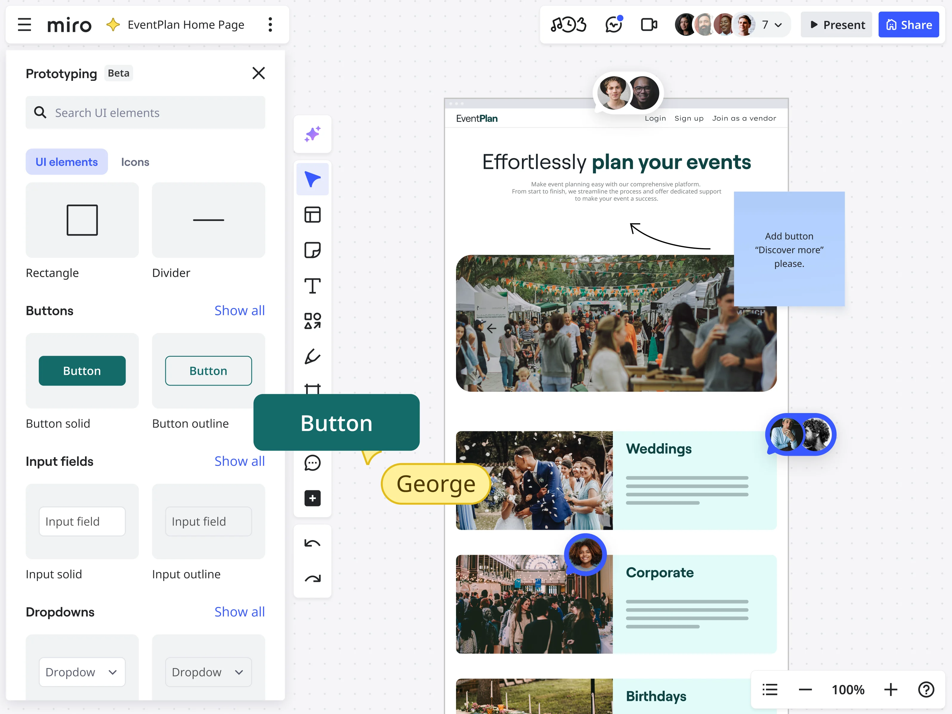
Creating mockups in Miro is a breeze. You can easily lay out your designs, pull in visual assets, and use tools to define every visual detail. Plus, with our strong collaboration features, your whole team can jump in to share feedback in real-time or async, keeping the momentum going. You can even start with something like our iPhone App Template to get a head start on visualizing your mobile masterpiece.
And what's a prototype then? It's about bringing your design to life with interaction
Now, if a mockup is the glossy photo, a prototype is more like a test drive. A prototype is an interactive, functional model of your product that simulates the user experience. This is where your design starts to do things. It’s about the look, the feel, and the function.
Prototypes are all about interactivity. Users can click buttons, navigate through different screens, experience animations, and get a genuine feel for how the product will work. This is crucial because it’s one thing to see a pretty picture, and quite another to actually use something. Prototypes can range in their level of detail, or what we call "fidelity."
Low-fidelity prototypes: These are often simple and a bit rough around the edges. Think paper sketches linked together or very basic digital click-throughs. They’re great for quickly testing core concepts and flows without getting bogged down in visual details.
High-fidelity prototypes: These look and feel much closer to the final product. They have detailed visuals (often built from mockups) and much richer interactivity.
Why are prototypes your best friend in the design process?
Simulate the real deal: They let users (and your team) experience the product's flow and interactions.
Test drive for usability: This is where you conduct usability testing to see where users get stuck, confused, or delighted.
Feedback on what works (and what doesn’t): You’ll get invaluable input on functionality and the overall user experience.
Validate your ideas: Prototypes help you confirm if your design solutions actually solve the user's problem effectively.
Clearer instructions for developers: They show developers exactly how interactions and animations should behave.
Save time and money: Catching design flaws or usability issues at the prototype stage is far less costly than fixing them post-launch.
When is it prototype time?
Whenever you need to test how users will interact with your product.
For dedicated usability testing sessions.
To demonstrate complex interactions, animations, or user flows that a static image just can't convey.
Before you commit to the significant time and resources needed for full-scale development.
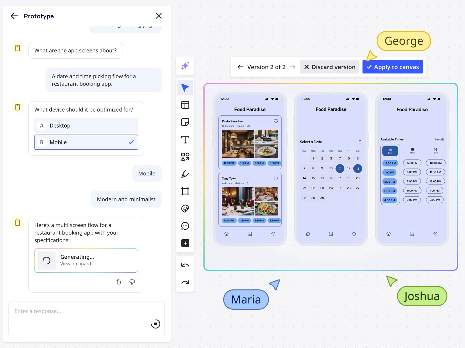
Miro, as your go-to innovation workspace, isn't just for static visuals; it's also a powerhouse for bringing those ideas to life. You can easily link frames to create interactive flows, making basic click-through prototypes a snap. And here's where it gets really exciting: Miro AI is here to supercharge your prototyping. Imagine instantly generating initial prototype concepts from your ideas, building out interactive flows with AI assistance, and rapidly iterating on your designs. It's all seamlessly integrated, meaning your team can move from a brainstormed idea on a Miro board to a testable, interactive prototype faster than ever. This empowers everyone to contribute and align on the product vision much sooner, keeping your project moving at lightning speed. Check out our Prototype Template to see how quickly you can get started.
Where does all the confusion come from when we talk about mockup vs prototype?
If you've ever mixed these terms up, you're definitely not alone. It’s a common point of confusion, and there are a few good reasons why the lines can get a bit blurry.
The "looks real" factor: Let's be honest, a really well-done high-fidelity mockup can look incredibly polished, almost like the finished product. When something looks that complete, it's natural for people (especially those less familiar with the design nitty-gritty) to assume it’s interactive or behaves like a prototype.
"Prototype" is a broad term: As we touched on, "prototype" itself covers a huge range – from those super simple paper sketches (low-fidelity) all the way to highly detailed, interactive digital versions (high-fidelity) that mimic the final product very closely. This wide spectrum means that a high-fidelity prototype and a high-fidelity mockup might visually appear quite similar at first glance, even though one is static and the other is interactive.
We use them casually: In everyday team chats, people might use "mockup" and "prototype" a bit loosely without always sticking to the strict definitions. It's often not intentional, but this casual, interchangeable use can lead to ingrained confusion over time.
They're close relatives: Often, a mockup directly evolves into a prototype. You design the screens and visual details in your mockup, and then you link those screens together and add interactions to create your prototype. Because they're so closely related in the workflow, it’s easy to see them as just slight variations of the same thing rather than distinct stages with distinct goals.
Focusing on the "thing" not the "why": Sometimes, the pressure is just to produce "a deliverable" for the next meeting. When the focus shifts away from the specific purpose that deliverable needs to serve (is it for visual validation? Or for usability and interaction testing?), the distinction between a mockup and a prototype can get lost.
Understanding these common tripwires is the first step to navigating them successfully!
Mockup vs prototype: Let's really nail down the key differences
Now that we've seen why it's easy to get them mixed up, let's put mockup and prototype side-by-side and make those core differences between mockup and prototype unmistakably clear. The best way to see it is often in a direct comparison:
Feature | Mockup | Prototype |
Main Goal | • To show you what the product will look like | • To show you how the product will work and feel |
Interactivity | • Nope, it's static. Purely visual. | • Absolutely! This is its defining feature. Clickable, interactive. |
Fidelity Focus | • High-fidelity in terms of visuals (colors, typography, imagery). | • Can be low-to-high fidelity, but the focus is on interactive fidelity. |
Primary Use | • Visual reviews, getting stakeholder buy-in on aesthetics, style guides. | • Usability testing, validating user flows, testing interactions and navigation. |
Feedback You Get | • Comments on colors, layout, fonts, overall visual appeal, branding. | • Insights into task completion, user confusion, ease of navigation, functionality. |
Time to Create | • Generally less time-consuming than a detailed prototype. | • Can be more time-consuming, especially for high-fidelity, complex interactions. |
Stage in Process | • Typically after wireframes, before interactive prototyping. | • After mockups (or sometimes directly from wireframes for low-fi versions). |
Think of it this way: you use a mockup to ask, "Does this look right?" You use a prototype to ask, "Does this work right? Does this feel right to use?"
The most important takeaway? Functionality is the king for prototypes. If you can click it, tap it, swipe it, or interact with it to mimic a user journey, you're in prototype territory. If it's a beautiful, detailed picture of your product but doesn't respond to your clicks, it's a mockup. Understanding this fundamental difference is key to choosing the right tool for the job and guiding your feedback sessions effectively.
"Help! Which one do I actually need?" Answering those common head-scratchers
Knowing the definitions is one thing, but applying them to your project can still feel a bit like a puzzle. Let's tackle some of those common questions and pain points head-on.
"Can't I just skip the mockup and go straight to a prototype?" You could, especially for very simple projects or if your team is incredibly aligned and experienced. However, for more complex products or when you need solid stakeholder agreement on the visual direction first, skipping mockups can be risky. You might spend a lot of time building interactivity for visuals that aren't even approved yet. Clarifying the look and feel with mockups first often saves you rework down the line.
"My mockup looks so real, isn't it basically a prototype?" This is a classic! A high-fidelity mockup can indeed look identical to a high-fidelity prototype screen. But remember the golden rule: can you interact with it to simulate a user flow? If not, it's still a mockup, focusing on visual validation. The moment you add those interactive links and hotspots, it transforms into a prototype, ready for experience testing.
Avoiding wasted resources (time, money, sanity!) This is where truly understanding the mockup vs prototype distinction pays off big time. Using a mockup when you only need to discuss visuals is efficient. Building a full-blown interactive prototype just to decide on a color scheme is… not. Choosing the right tool for the stage you're in prevents your team from spinning wheels, redoing work, and ultimately saves budget and keeps morale high.
Bridging communication gaps When your designer talks about needing "feedback on the mockup," and your developer is expecting "a prototype to see the flow," wires can get crossed if everyone isn't clear on the terms. Establishing a shared understanding (perhaps by sharing this article!) ensures everyone is speaking the same language, leading to smoother collaboration and more productive feedback.
How Miro helps you master both mockups and prototypes in one collaborative space
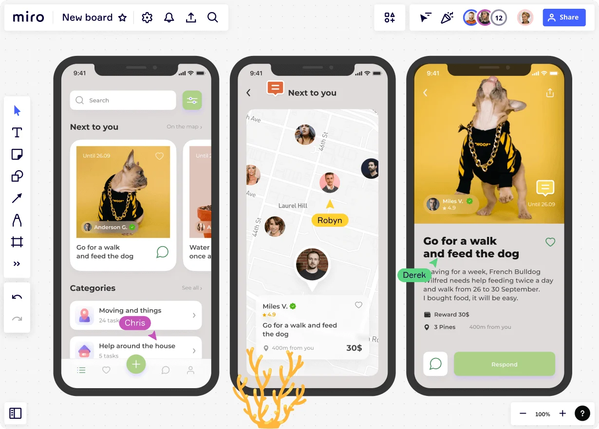
Okay, so you get the difference. Now, how can you actually create these things without bouncing between a dozen different tools? That's where your innovation workspace, Miro, truly shines. We designed it to support your entire design journey, from the earliest brainstorms to interactive prototypes, all while keeping your team connected.
For crafting those pixel-perfect mockups: Miro's intelligent canvas gives you all the space you need. You can easily import images, use a vast library of icons and shapes, and fine-tune visual details. Our visual planning capabilities mean you can lay out multiple screens, create mood boards, and gather visual inspiration right alongside your mockups. And because collaboration is in our DNA, your team can drop comments, provide feedback with sticky notes, or even co-create in real-time, no matter where they are.
For bringing your designs to life with prototypes: Ready to make those mockups interactive? Simply link your frames or objects within Miro to create click-through prototypes that simulate user flows. It's intuitive and quick. But the real magic happens with Miro AI. Need to get a prototype off the ground fast? Let AI help you generate initial concepts. Want to build out those interactive pathways without the usual drag-and-drop marathon? AI can assist, making the process smoother and quicker. This means you can iterate on your designs rapidly, get feedback, and refine your prototype with unprecedented speed, all within the familiar Miro environment your team already loves.
A seamless journey, not a series of handoffs: Because Miro supports these different stages, the transition from a wireframe to a mockup, and then to an interactive prototype, feels natural. There's less need to export and import between different platforms, reducing the chance of version control headaches and keeping all your design thinking and feedback in one central, accessible place.
Think about using our iPhone App Template to quickly sketch out your mobile app's visual design, get feedback, and then use Miro's linking features or Miro AI to turn those static screens into a clickable prototype you can test with users—all without leaving your board.
Where do mockups and prototypes fit in the grand scheme of design?
It's helpful to see where these two crucial steps sit within the typical design workflow. While it’s not always a strictly linear path, a common progression looks something like this:
Wireframe (the blueprint): This is your basic structural sketch. It outlines the layout, content hierarchy, and core functionality with very low visual fidelity—think boxes and lines. Its job is to define "what goes where" and the basic user flow.
Mockup (the visual design): This is where you add the skin to those wireframe bones. You bring in the colors, typography, imagery, and branding to create a static, high-fidelity representation of what the product will look like.
Prototype (the interactive experience): Now you take those beautiful mockups (or sometimes simpler wireframes for low-fi versions) and make them interactive. You link screens, add clickable elements, and simulate animations to show how the product will function and how users will navigate through it.
Each stage builds upon the last, allowing you to make informed decisions and gather specific types of feedback before committing to the next level of detail and effort.
Choosing the right path: It’s all about clarity and impact
So, mockup vs prototype? As you've seen, it’s not about which one is "better" – it’s about understanding their distinct superpowers and deploying the right one at the right time for the right reasons.
To recap the essentials:
Mockups are your static, visual stars. They show what your product will look like, perfect for aligning on aesthetics and visual branding.
Prototypes are your interactive heroes. They let users experience how your product will function, crucial for usability testing and refining user flows.
Understanding the differences between mockup and prototype isn't just academic; it's practical. It empowers you to lead more effective design reviews, gather more targeted feedback, communicate more clearly with your team and stakeholders, and ultimately, build better products faster. It means less guesswork, fewer expensive revisions late in the game, and a smoother path from initial idea to final launch.
Ready to stop the confusion and start creating with clarity? Why not try prototyping in Miro? Explore how our intuitive tools, collaborative features, and the power of Miro AI can help you and your team effortlessly move from static visuals to interactive experiences, all in one unified workspace.
Author: Miro Team
Last update: October 10, 2025