Get the pricing right with a supply and demand graph maker
Graphing supply and demand made easy
Why Miro is great for graphing supply and demand
Plan for better outcomes
Miro’s infinite canvas allows you to add sticky notes, documents, and other artifacts to support your graph creation. Plan market strategies and share your pricing insights with your supply and demand graph.
Flexible graph creation
Miro’s supply and demand graph maker is highly customizable. Drag and drop shapes to create your graph, and double-click them to edit and format. Easily tailor your graph to fit your presentation.
Everything in one place
Tap into 300+ free, ready-made templates — including supply and demand graphs, flowcharts, timelines, and more — then turn them into project hubs. Miro’s visual workspace allows you to ideate, manage, and collaborate on projects all in one shared space.
Get instant feedback
Use a supply and demand curve graph maker to adjust pricing and business plans. Request input from stakeholders by tagging them in comments or stickies so you move faster in implementing changes.
Integrated with your favorite tools
Related templates
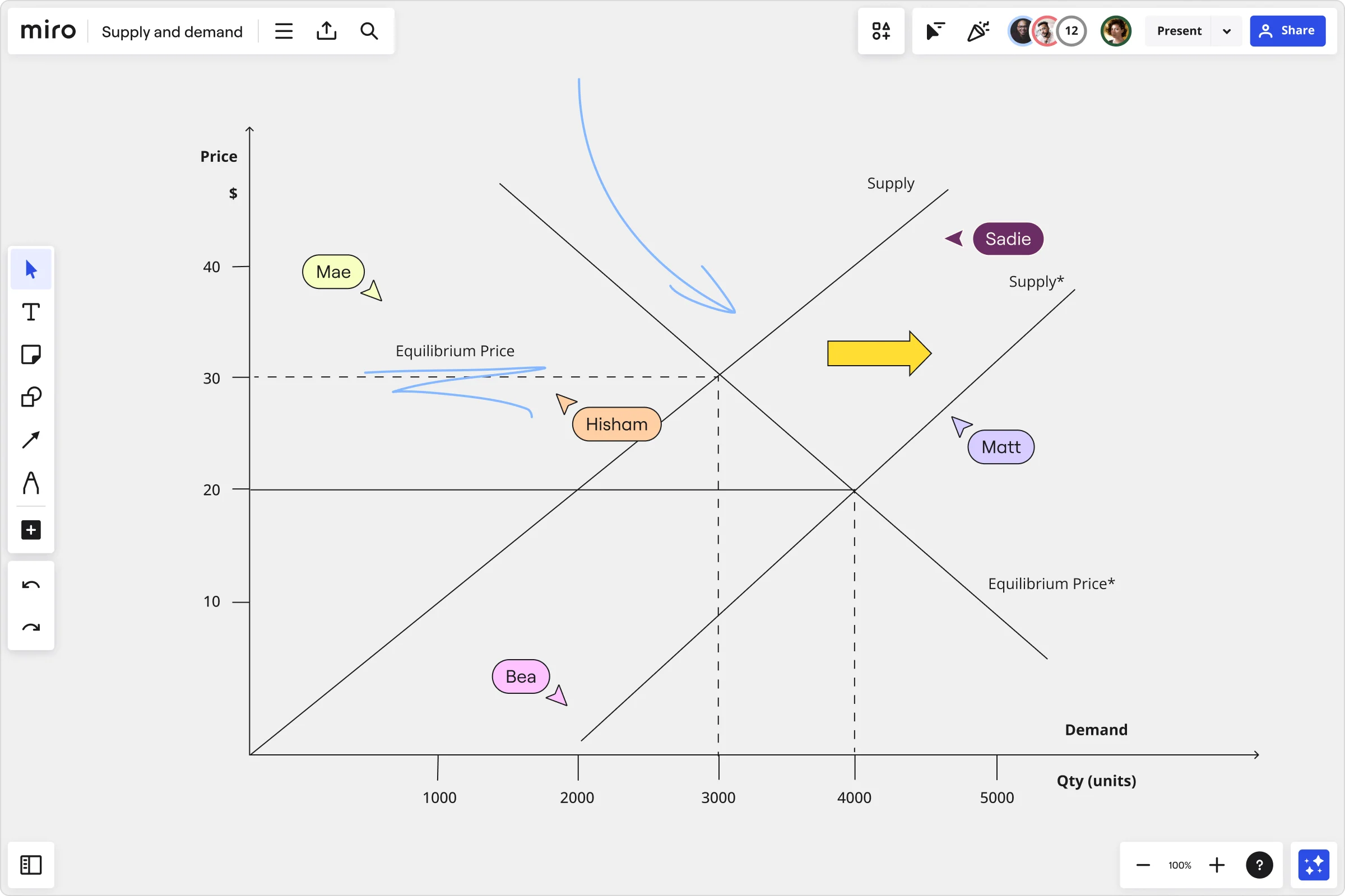
How to make a supply and demand graph with Miro

The world's most innovative companies are collaborating in Miro, everyday
“With Miro, we went from project brief to in-market launch in 10 months. That usually takes 3 years at PepsiCo.”
Caroline de Diego
Senior Manager, Global Design & Marketing Innovation at PepsiCo

“Bringing everyone together to plan in Miro means the most impactful initiatives will happen at the right time.”
Lucy Starling
Product Operations Lead at Asos

“The team onboarded in 10 minutes to use Miro for workshops. Getting our organization to adopt this product was a no-brainer.”
Konrad Grzegory
Agile Transformation Lead at CD PROJEKT RED

“Miro templates helped us go from scratch to a full-fledged plan where we mapped activities, ideas, and dependencies.”
Marc Zukerman
Senior Director of Project Management at Hearst

“Miro allows all our teams to align themselves with certain tools and models: they work independently and create products that really meet our customers' needs.”
Luke Pittar
Sustainability Innovation & Design Coach at The Warehouse Group

“To be truly innovative, everyone needs to have a voice, and everyone needs to be able to iterate on each other’s ideas. Miro has made that possible for us.”
Brian Chiccotelli
Learning Experience Designer at HP

Users love Miro for end-to-end innovation. We're the G2 leader in visual collaboration platforms and are rated in the top 50 enterprise tools. Miro helps large companies get meaningful work done.
Top 50 Products for Enterprise
G2 reviews

Supply and demand graph maker FAQs
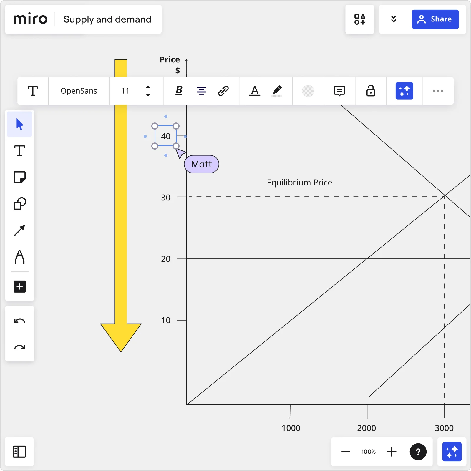
How do you analyze a supply and demand graph?
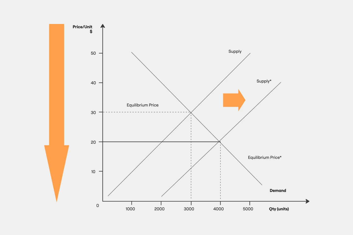
A supply and demand graph is used to show the relationship between the amount of a product that is available (supply) and the amount of the product that people want to buy (demand). By analyzing the graph, you can identify trends in the market and make predictions about how the market will change in the future. The graph will typically have two lines, one for the supply of the product and one for the demand. The slope of these lines will show whether the market is in equilibrium (both lines relatively flat) or if there is an imbalance in the market (one line rising or falling quicker than the other). The point of intersection between the two lines is the market equilibrium price, which is the price where the amount of product supplied is equal to the amount of product demanded.