Table of contents
Table of contents
The ultimate guide to data flow diagrams
Summary
In this guide, you will learn:
What a Data Flow Diagram (DFD) is: a graphical representation of data movement in a system.
The four main components of a DFD: Processes, Data Flows, Data Stores, and External Entities.
How DFDs use symbols to visually map system interactions.
The purpose and benefits of DFDs: to clarify system functionality, aid analysis, design, and troubleshooting.
The hierarchical levels of DFDs, from Level 0 to Level 2, for exploring system complexity.
Different notation styles and how DFDs help identify system weaknesses.
Data flow diagrams (DFDs) are super helpful for planning and identifying how data moves through a system. In this guide, we’ll cover everything you need to know about data flow diagrams — including what they are, why they matter, and how you can create one.
Let’s jump in.
Try Miro now
Miro's DFD tool lets you easily create diagrams online with automated features.
What is a data flow diagram?
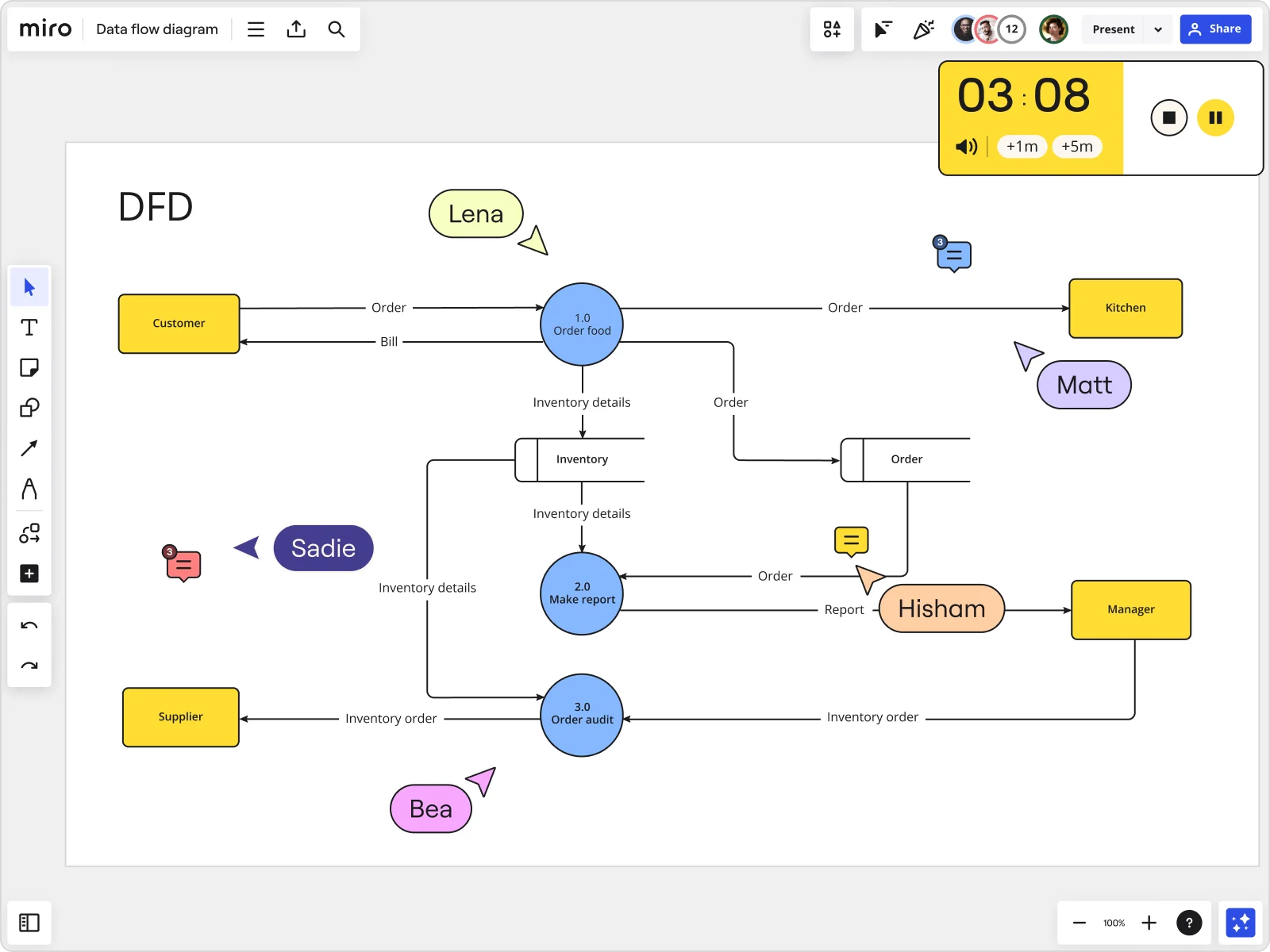
A data flow diagram (DFD) maps out how information, actors, and steps flow within a process or system. It uses symbols to show the people and processes needed to move data correctly.
DFDs are important because they help you visualize how data moves through your system, spot inefficiencies, and find opportunities to improve overall functionality. This leads to more efficient operations, better decision-making, and enhanced communication among team members.
Businesses often use data flow diagrams to visualize how data moves within their information systems. These diagrams show how data enters a system, gets processed, and where it ends up. This sets DFDs apart from a workflow diagram or flowchart, which are broader and can represent any process or system within a company.
Data flow diagrams vs. flowcharts
Wondering how to tell the difference between a flowchart and a data flow diagram? It’s all in the arrows. In a flowchart, arrows show the order of events. In a data flow diagram, arrows represent the flow of data and information. This subtle difference can help you choose the right tool for visualizing your processes.
TIP: A data flow diagram can be as simple or as complex as the system it represents, but as long as you’ve got an easy-to-use data flow diagram tool with powerful diagramming features, you’re all set.
Data flow diagrams vs. UML diagrams
While both UML diagrams and data flow diagrams help with system modeling, there are key differences worth keeping in mind. Software engineers typically use UML diagrams to model system structure and behavior in object-oriented design. These diagrams include various types like class diagrams, sequence diagrams, and activity diagrams.
Data flow diagrams (DFDs), on the other hand, are generally used to show how data moves through a system, emphasizing data flow and processes rather than detailed software behavior. While they both make use of diagrams to explain systems, they ultimately serve different purposes within system design and analysis.
Key principles of data flow diagrams
There are a few key principles that help define what data flow diagrams are. Applying them will also help you keep your diagrams clear, consistent, and accurate.
Directionality: Your data should flow in one direction—from input to output.
Connectivity: Every data flow should connect to a process or a data store. This way, your data has a clearly defined source and destination.
Naming conventions: Use consistent and clear labels for processes, data stores, data flows, and external entities. This makes your data flow diagram easy to understand for your team and stakeholders.
Process hierarchy: Establish a clear hierarchy to differentiate broader functions from more detailed ones. This simplifies the system’s complexity and clearly shows the logical flow.
Why use a data flow diagram
Now, let's get into why you should use a data flow diagram in the first place. While they're often associated with technical workflows, DFDs are versatile tools that can add value across different roles and projects. Here's why:
1. Simplifies complex systems: DFDs break down complicated processes into manageable chunks. Whether you're mapping out an e-commerce checkout or a user authentication flow, the diagram helps you visualize each step and interaction without getting lost in technical details. 2. Improves team collaboration: For product managers, designers, and developers, a DFD ensures everyone is on the same page. It gives your team a shared understanding of how data flows within the system, which can help prevent miscommunication and minimize bottlenecks in the development process.
3. Identifies inefficiencies and gaps: A data flow diagram makes it easier to spot inefficiencies or potential issues. Whether it's an unnecessary data handoff or a point where data flow could break, DFDs help you address them before they become problems in production.
4. Supports agile development: DFDs offer quick insights in fast-paced environments. They help with iterative improvements, whether you're adding new features, adjusting system architecture, or optimizing user flows. When built using Miro, your DFDs can be adjusted and improved in real time or asynchronously, ensuring that even remote teams can contribute and review diagrams without slowing down the workflow.
5. Improves documentation: A well-crafted DFD also serves as living documentation, making it easier to onboard new team members or share system knowledge across departments. It gives both technical and non-technical stakeholders an easy-to-understand visual of how data moves through your product or service.
When to use a data flow diagram
Data flow diagrams are useful across industries, especially in tech-driven environments where data management is critical. Let's look at some common scenarios where DFDs are particularly useful:
Software engineering
DFDs are great for software engineers to plan software architecture and continuously improve system performance.
Business management
DFDs are especially useful in business management to streamline workflows and enhance operational efficiency.
Database development
DFDs play a crucial role in mapping data flow and ensuring robust cybersecurity measures, making them indispensable as digital platforms become increasingly important for businesses.
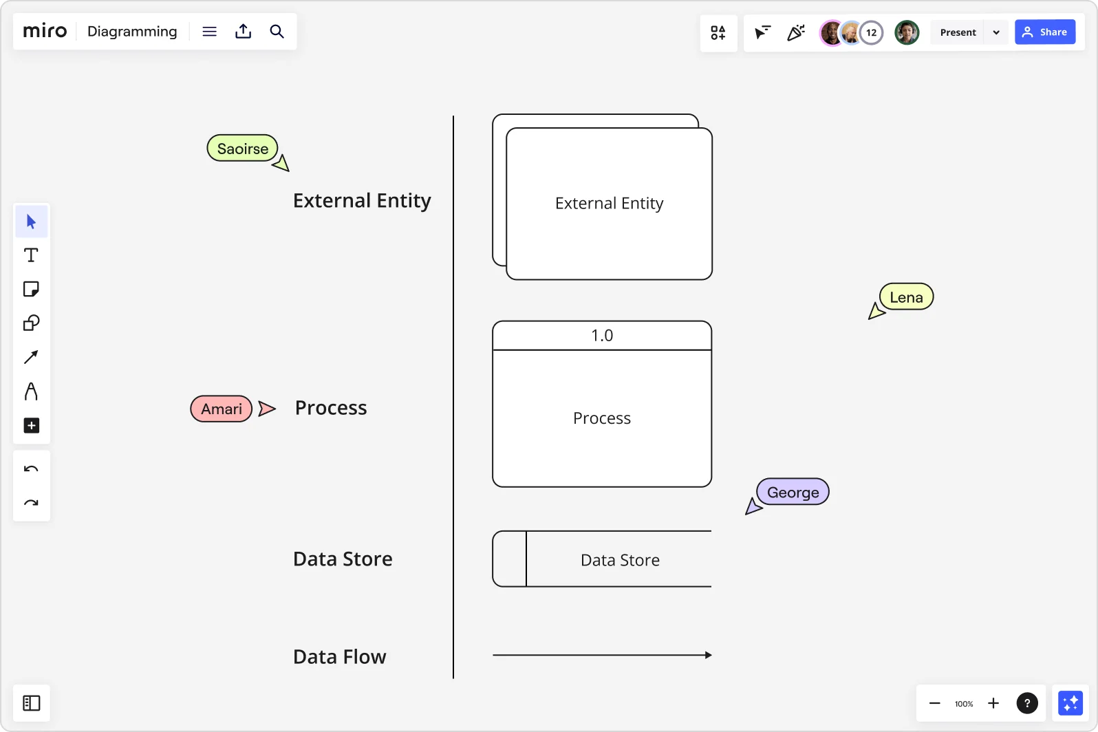
Symbols for data flow diagrams
Data flow diagrams use a set of standardized symbols to represent components. These symbols make it easier for your team to read and understand your diagrams.
External entity
External entities are actors, sources, sinks, or terminators. They exist outside the system and are responsible for sending or receiving data. In other words, they’re the sources and destinations of the system’s inputs and outputs.
Process
The process component represents the system’s activities that transform incoming data into outputs. These are usually depicted as circles or rounded rectangles.
Data store
The data store component is where the system stores data. These are typically represented as open-ended rectangles or two parallel lines, indicating a storage location such as a database or file.
Data flow
Data flow components are the pathways through which data moves in the system. In a data flow diagram, these are shown as arrows, indicating the direction of data movement.
Data flow diagram levels
Data flow diagrams are structured in layers, with each layer providing more details about the system’s processes or data flow. These layers typically range from Level 0 to Level 2, with some systems extending to Level 3 for deeper complexity.
The number of layers you add to your diagram depends on how detailed you want your diagram to be — which typically depends on who you’re creating your diagram for. Let’s take a closer look at what each level helps communicate:
Data flow diagram Level 0
Level 0 is usually the context level of a data flow diagram. At this level, the diagram gives a basic overview of the entire system without focusing on specific parts.
Think of Level 0 as the starting point for understanding the system at a high level. It identifies the main processes and their interactions. This type of diagram is great for helping stakeholders and team members grasp the system's scope and its primary inputs and outputs without overwhelming them.
Data flow diagram Level 1
At Level 1, things get more detailed, with the diagram breaking down Level 0’s high-level processes into more specific functions.
Basically, it maps out the flow of data between processes and identifies the main functions that drive the system's operations. This level of detail is important for understanding how data moves through different stages of the system and how each process contributes to the overall workflow.
Data flow diagram Level 2
Level 2 dives deeper into the processes outlined in Level 1, providing a detailed look at specific sections of the system.
This level of detail allows system designers and analysts to uncover intricate interactions and dependencies between processes — and it's important for identifying potential bottlenecks, streamlining workflows, and making sure data flows throughout the system smoothly.
Types of data flow diagrams
Data flow diagrams are divided into two main types based on the flow they visualize: logical data flow diagrams and physical data flow diagrams. Each type serves specific purposes and provides unique benefits.
Logical data flow diagram
Logical data flow diagrams focus on the activities and processes within a business. They show "what" happens in a graphical format, emphasizing the business's functions, services provided, and goals. These diagrams visualize business events and the data required for those events to occur.
Using a logical data flow diagram is valuable for mapping out business processes. It helps clarify the current functionality of your business and identifies potential areas for improvement or enhancement.
Physical data flow diagram
A physical data flow diagram visualizes how business systems are implemented in real-world terms. It explains how data moves through the system and details the software, hardware, and files involved in the process.
Physical data flow diagrams provide a deeper insight into system architecture and operational details. Together with logical data flow diagrams, they give you a complete picture of how the system functions, from planning and understanding to putting it into action.
Examples of data flow diagrams
DFDs are helpful for mapping out all kinds of complex systems and processes. Let’s take a look at a few data flow diagram examples:
Online purchase system
Making an online purchase may seem as simple as clicking ‘check out’ and entering details, but much more happens behind the scenes. A data flow diagram (DFD) can visualize the entire process, from a user's decision to buy to their order confirmation.
DFDs show how customer data travels through the system and where it is stored, helping to understand the process and identify bottlenecks or areas for improvement.
Customer Relationship Management (CRM) system
Many businesses use CRM platforms to manage customer data — and a data flow diagram helps provide a clear overview of how the system does that. Possible inputs include a customer signing up for a free trial or an employee emailing a client. Outputs might include a completed customer profile or a customer receiving a sales email.
A DFD not only helps businesses maintain a clear view of how they interact with customers but also to come up with ways to improve relationships.
Library management system
Anyone who’s spent time in a library can imagine how much information there is to manage, from book titles to borrower statuses. Thankfully, there are databases and other management systems to keep things under control — and a data flow diagram helps visualize how they work.
Potential inputs include a librarian making changes to the inventory or a user signing up for a library membership. Possible outputs include user alerts about upcoming due dates or notifications about new library members. A DFD can optimize library management and enhance user experience for both librarians and borrowers.
How to create a data flow diagram
Now that you know what a data flow diagram is and how it’s typically structured, it's time to create your own.
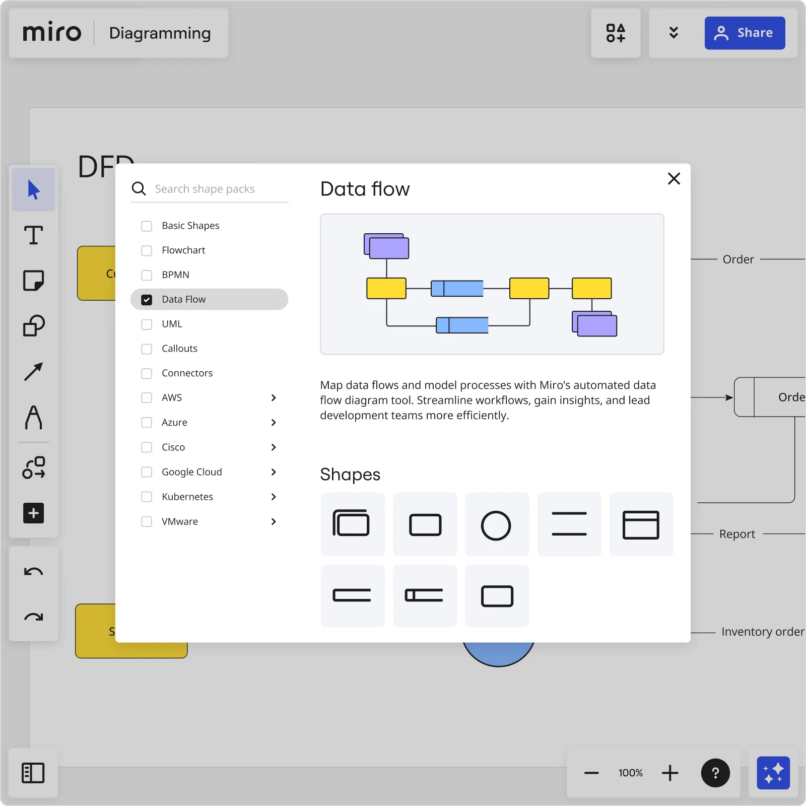
While the process might seem daunting, having an easy-to-use data flow diagram tool will keep things simple. But if you’re not ready to create one from scratch, why not use Miro’s Data Flow Diagram Template? It’s fully customizable, allowing you to adapt it exactly to your needs.
No matter which method you go for, here’s a quick step-by-step guide to help you create an effective data flow diagram:
1. Identify inputs and outputs
Start by sorting out your inputs and outputs. Each process you map should have at least one input and one output. This will help make sure your data flow diagram is complete and has no loose ends.
2. Create a high-level overview (Level 0)
Begin your diagram with a high-level overview of the system. This Level 0 diagram gives you a broad context of the system and helps you decide if you need to go into more detail with more levels.
3. Break down the main functions (Level 1)
Next, break down the main functions from your high-level overview into smaller, more detailed processes. This Level 1 diagram focuses on specific systems within your business.
Add more processes and steps, and remember to use the standardized data flow diagram symbols and shapes mentioned earlier.
4. Add detail as needed (Level 2 and beyond)
Continue to add more levels for greater detail. Each new level should further break down the processes into more specific steps.
There's no limit to the number of levels you can add, but keep in mind that your data flow diagram should remain easy to understand. Share your diagram with your team members and invite them to leave feedback, ask questions, and make suggestions.
TIP: Want to get your team’s input? Miro comes with multiple options to share your work. Invite others to view and comment on your Miro board, share it via a link, or export it as a PDF or image.
Creating your diagram with Miro's ready-made data flow template
When it comes to creating a data flow diagram, Miro's ready-made data flow diagram template simplifies the process, making it fast and intuitive to visualize any type of data movement across your system. Whether you're designing a process from scratch or refining an existing flow, Miro's template provides the perfect starting point.

Here's how you can use it to create any type of data flow diagram:
1. Start with the template: Miro's template includes pre-defined elements like data sources, processes, data stores, and external entities. This framework allows you to quickly start visualizing the flow of data without having to design each component manually. You can customize the template to fit your specific needs by simply dragging and dropping items onto the canvas.
2. Customize to your use case: Whether you're building a login system flow or mapping out a payment process, Miro's template can be tailored to your scenario. You can easily add or remove elements, adjust data flow paths, and label components in a way that makes sense for your team.
3. Collaborate in real time or async: You can work on your data flow diagram with team members in real time, allowing for quick iterations and feedback. Or, if your team is working asynchronously, Miro's comments and notes features make it easy to leave feedback and suggestions without disrupting the flow.
4. Automate and streamline: Miro’s automated diagramming capability is a game-changer. With this feature, you can automatically generate the foundational structure of your data flow diagram by inputting basic system details. This saves you time and lets you focus on refining the flow, identifying key interactions, and ensuring the accuracy of your data movement.
5. Iterate and evolve: Your data flow diagram isn't static. As your product evolves, so will your processes. With Miro's innovation workspace, you can easily revisit and update your DFDs, making sure they're always current and aligned with your latest development milestones.
Miro's template not only gives you a head start but also ensures that you're building your diagram within an intuitive and collaborative environment. From beginners to seasoned professionals, Miro provides the tools you need to create clear, informative data flow diagrams that help move your projects forward — faster and smarter.
Benefits of data flow diagrams
Data flow diagrams go beyond just visually representing system processes. In fact, here are some of the specific benefits they bring:
Clarifies a system’s scope
Data flow diagrams clearly outline where a system starts and ends. This is crucial for defining the scope of a project or system, avoiding misunderstandings, and making sure everyone agrees on what's included and excluded.
Improves communication between teams
By showing data flow visually, DFDs make it easier for system designers, developers, and users to communicate clearly. This visual representation helps teams discuss and refine system requirements effectively, helps keep everyone is on the same page.
Makes complex structures easier to understand
Complex data structures can be hard to understand, but data flow diagrams make things easier to interpret and digest. They help teams see how data moves through different stages of a system or software, making it easier to spot inefficiencies and areas for improvement.
Visualizes logic and data flow
Data flow diagrams visualize the logical sequence of how data moves within a system. This level of clarity helps non-technical stakeholders understand how inputs get processed to produce outputs. Not only does it promote transparency in system operations, but it also leads to more informed decision-making.
Who can use data flow diagrams?
While they might seem more popular among engineering roles, there are actually plenty of teams that can benefit from creating a data flow diagram. Here are a few examples of who might use a DFD:
Growth teams
Growth teams rely heavily on data to identify new opportunities and optimize existing processes. DFDs help these teams by providing a clear visualization of data flows, helping them understand how data influences growth metrics, how it's tracked, and where it's stored.
Data analysts
It’s no surprise that data analysts would benefit from data flow diagrams, given that they focus on extracting valuable insights from all kinds of data. Data flow diagrams help data analysts understand the structure and flow of data within systems, which can be very helpful for analysis and reporting.
Product teams
Product teams focus on improving the customer experience and product functionality. Data flow diagrams come in handy for mapping out how data flows through the product ecosystem, from input to output. This helps them identify potential bottlenecks, streamline processes, and improve overall usability.
Create your data flow diagram in Miro
It’s one thing to know what a good data flow diagram looks like. It’s another thing altogether to have the right tool to bring your ideas to life. If you’re looking for an intuitive interface that still comes with advanced technical diagramming tools to visualize complex systems, Miro is your best bet.
Miro is also designed to bring teams together — even if you aren’t in the same room. It’s the perfect solution for mapping data flows while keeping teams on the same page.
But why not see for yourself?
Sign up for Miro to start creating your data flow diagram.
Author: Miro Team
Last update: October 9, 2025